Top 5 Home Color Trends Dominating US Interiors in 2025
Advertisement
The 2025 home color trends for US interiors are defined by a fusion of nature-inspired hues and personal well-being, emphasizing serene blues, warm neutrals, and vibrant earthy tones to create harmonious and inviting living spaces for families.
Are you ready to refresh your living spaces and infuse them with the latest style? Understanding the Top 5 Home Color Trends Dominating US Interiors in 2025 is your first step towards creating a home that feels both current and uniquely yours. As we look ahead, the palette for US homes is shifting towards colors that evoke comfort, tranquility, and a deeper connection to nature, perfectly aligning with the needs of modern families seeking harmonious environments.
The Rise of Serene Blues and Greens: Nature’s Embrace Indoors
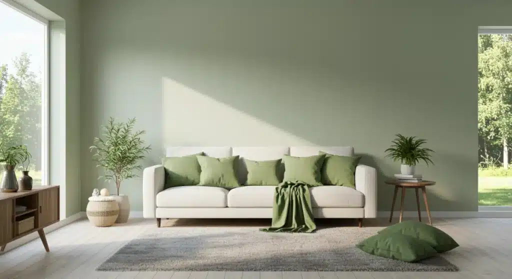
In 2025, the US interior design landscape will see a significant embrace of serene blues and greens, reflecting a collective desire for calm and connection to the natural world. These hues are not merely decorative choices; they are foundational elements for creating spaces that promote peace, reduce stress, and offer a refreshing sanctuary from the outside world. Think of the tranquil depths of the ocean or the soothing expanse of a lush forest, brought directly into your home.
Advertisement
The popularity of these colors stems from their inherent ability to foster a sense of well-being. For busy families, a home that serves as a calming retreat is invaluable. These shades work wonderfully in various rooms, from bedrooms designed for restful sleep to living areas where families gather to relax and reconnect. Their versatility also allows them to pair beautifully with a wide range of textures and materials, from natural woods to soft, organic fabrics.
Shades of Tranquility: Ocean and Sky Hues
Blues, particularly those reminiscent of vast skies and deep waters, will be prominent. These include muted teals, dusty indigos, and soft sky blues. They offer a sophisticated backdrop that can be both subtle and impactful, depending on their application.
- Dusty Indigo: Adds depth and a touch of drama without overwhelming a space, ideal for accent walls or statement furniture.
- Soft Sky Blue: Perfect for creating an airy and expansive feel, particularly in smaller rooms or areas with limited natural light.
- Muted Teal: A versatile shade that bridges blue and green, offering a refreshing yet sophisticated touch.
Earthy Greens: Bringing the Outdoors In
Complementing the blues are a variety of greens that echo the natural world. Sage green, olive green, and deeper forest greens will be favored for their grounding and revitalizing qualities. These colors are particularly effective in creating a biophilic design aesthetic, blurring the lines between indoor and outdoor living.
Advertisement
Incorporating these greens can transform a room into a serene oasis, promoting focus and creativity. They are excellent choices for home offices, children’s playrooms, or even family bathrooms, where a sense of freshness is always welcome. The key is to select shades that resonate with your personal style while still contributing to the overall calming ambiance.
The trend towards serene blues and greens signifies a broader movement towards mindful living and creating spaces that nurture the soul. These colors are not just about aesthetics; they are about fostering an environment where every family member can thrive, relax, and find peace. Their timeless appeal ensures that your home will remain stylish and comfortable for years to come.
Warm Neutrals: The Foundation of Comfort and Versatility
While vibrant colors certainly have their place, the enduring appeal of warm neutrals remains steadfast, evolving to become even more inviting and sophisticated in 2025. These are not your grandmother’s beige walls; today’s warm neutrals are nuanced, rich, and form the perfect foundation for any interior design scheme. They are about creating a sense of coziness, approachability, and timeless elegance within American homes, making them ideal for family-centric living.
The beauty of warm neutrals lies in their incredible versatility. They provide a calm canvas that allows other design elements, such as artwork, furniture, and textiles, to truly shine. For families, this means a flexible environment that can adapt to changing tastes, seasonal decor, and the evolving needs of children. They also contribute to a brighter, more expansive feel in a home, making spaces appear larger and more open.
Beyond Beige: Embracing Greige and Creamy Whites
The spectrum of warm neutrals for 2025 extends beyond traditional beige to include sophisticated greiges and creamy off-whites. Greige, a harmonious blend of gray and beige, offers a contemporary edge while retaining warmth. Creamy whites, on the other hand, provide a soft luminosity that can brighten any room without feeling stark.
- Sophisticated Greige: A modern and adaptable shade that pairs well with both cool and warm accents, making it a go-to for many design styles.
- Creamy Off-Whites: Ideal for creating a soft, inviting atmosphere, especially when combined with natural light and varied textures.
- Warm Stone Tones: Think of colors found in natural stone, providing a grounded and earthy feel that is both chic and comforting.
Layering Textures for Depth
To prevent warm neutral spaces from appearing monotonous, the key is to layer textures. Introduce elements like chunky knit throws, linen curtains, woven rugs, and wooden furniture. These tactile additions create visual interest and add depth, transforming a simple palette into a rich and engaging environment.
Consider using different finishes on your walls, such as matte paints for a velvety look or subtle textured wallpapers for added dimension. The interplay of light and shadow on these surfaces will bring the neutral colors to life, making the space feel dynamic and inviting. Warm neutrals are more than just background colors; they are active participants in creating a comfortable, stylish, and adaptable home that can grow with your family.
By carefully selecting and layering warm neutrals, homeowners can achieve a sophisticated yet welcoming aesthetic that prioritizes comfort and longevity. This trend speaks to a desire for enduring style and practical beauty, ensuring that your home remains a cherished space for all.
Earthy Terracottas and Rich Rusts: Grounding and Inviting Hues
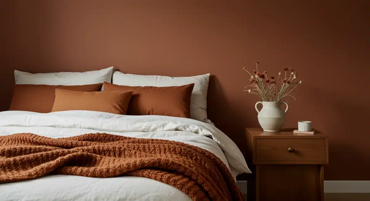
Moving into 2025, a significant trend emerging in US interiors is the embrace of earthy terracottas and rich rusts. These colors draw inspiration directly from the earth, evoking the warm, sun-baked landscapes of deserts and ancient pottery. They bring a profound sense of grounding, warmth, and an inviting, organic feel to any space, perfectly complementing a desire for natural and authentic living environments.
These hues are a departure from cooler, more minimalist trends, offering a rich and comforting alternative. They infuse rooms with a sun-drenched glow, making them feel instantly cozier and more connected to nature. For families, these colors can create nurturing spaces that feel safe and stimulating, encouraging creativity and relaxation. Their inherent warmth makes them particularly suitable for living rooms, kitchens, and even children’s bedrooms where a sense of security is paramount.
The Allure of Terracotta
Terracotta, with its reddish-brown origins, provides a versatile palette that can range from soft, muted clay tones to deeper, more saturated brick shades. It’s a color that speaks of handcrafted beauty and a connection to artisanal traditions, adding character and warmth to modern homes.
- Muted Clay Terracotta: Excellent for creating a subtle, earthy backdrop that is calming and understated.
- Vibrant Brick Red: Can be used as an accent or on a single wall to add a bold, energetic statement.
- Burnt Orange: A more intense shade that brings a touch of bohemian chic and warmth.
Rich Rust Tones: Depth and Sophistication
Rust colors, often seen as a deeper, more oxidized version of terracotta, offer a sophisticated richness. These shades, ranging from burnt orange to deep reddish-browns, add an element of luxury and depth. They work beautifully with metallic accents like brass or copper, enhancing their inherent warmth and creating a luxurious feel.
When incorporating these colors, consider using them in conjunction with natural materials such as unpolished wood, natural stone, and woven fabrics. This combination amplifies their organic appeal and creates a cohesive, earthy aesthetic. They can be used on walls, in upholstery, or through decorative elements like pottery and textiles, providing a tactile experience that enriches the visual appeal of a room.
The trend of earthy terracottas and rich rusts is a testament to the desire for homes that feel authentic, lived-in, and deeply comforting. These colors contribute to an atmosphere that is both stylish and incredibly inviting, making them perfect for creating family spaces that are both beautiful and functional.
Deep Jewel Tones: Adding Drama and Luxury
For those looking to infuse their US interiors with a touch of opulence and drama, deep jewel tones are making a magnificent comeback in 2025. These rich, saturated colors — think emerald green, sapphire blue, amethyst purple, and ruby red — offer a luxurious counterpoint to the more subdued palettes, providing depth, sophistication, and a bold statement. They are perfect for creating focal points and adding a sense of grandeur to any room, transforming ordinary spaces into extraordinary ones.
Jewel tones are not just about color; they are about texture and sheen. When applied in materials like velvet, silk, or high-gloss paint, they reflect light beautifully, adding to their inherent richness. This trend caters to a desire for more personality and daring choices in home decor, appealing to families who wish to create distinctive and memorable living environments. These colors can elevate a room, making it feel both grand and intimately inviting.
Emerald Green: Nature’s Opulence
Emerald green, with its vibrant and profound presence, is a standout jewel tone. It signifies renewal, growth, and a connection to nature’s most luxurious aspects. It can be used as an accent color in cushions and throws or for a statement piece of furniture, such as a velvet sofa.
- Statement Walls: An emerald green accent wall can dramatically transform a dining room or living area, adding depth and elegance.
- Plush Textiles: Velvet armchairs or large throw pillows in emerald green introduce a touch of luxury and comfort.
- Artistic Accents: Incorporate smaller elements like vases, sculptures, or even indoor plants with deep green foliage to tie the theme together.
Sapphire Blue and Amethyst Purple: Royal Depth
Sapphire blue brings a sense of calm authority and timeless elegance, reminiscent of deep ocean waters or a twilight sky. Amethyst purple, on the other hand, adds a touch of creative flair and mystique. Both colors work exceptionally well in formal living spaces, master bedrooms, or even a sophisticated home library.
These colors can be balanced with neutral tones to prevent overwhelming a space. Imagine a sapphire blue accent wall complemented by creamy white furniture and brass accents, or an amethyst-colored rug grounding a room with light gray walls. The key is to use these powerful colors strategically to create visual impact without sacrificing comfort. Deep jewel tones represent a bold step towards expressive interiors, allowing families to craft homes that truly reflect their unique style and aspirations for luxury.
By thoughtfully integrating these rich hues, homeowners can achieve a sophisticated and dramatic aesthetic that is both striking and deeply personal. This trend encourages a playful yet refined approach to color, making spaces feel vibrant and alive.
Soft Pastels and Muted Brights: Playful Yet Sophisticated
For US interiors in 2025, there’s a charming emergence of soft pastels and muted brights, offering a refreshing and playful alternative to more intense color palettes. These shades are not the sugary pastels of nurseries past; rather, they are sophisticated, slightly desaturated versions of primary and secondary colors that bring a gentle vibrancy and an uplifting spirit to any home. They are perfect for creating spaces that feel light, airy, and inject a subtle pop of color without being overwhelming, ideal for family homes seeking a cheerful yet refined atmosphere.
This trend speaks to a desire for optimism and joy within the home, while maintaining a sense of elegance. Soft pastels and muted brights are incredibly versatile, working well in children’s rooms, play areas, and even adult spaces like kitchens and living rooms. They invite creativity and a sense of lightness, making them perfect for fostering a positive and inspiring environment for the entire family. Their softer saturation ensures they blend harmoniously, creating a cohesive and pleasant visual experience.
Blush Pink and Powder Blue: Gentle Serenity
Blush pink and powder blue are quintessential soft pastels that continue to charm. They introduce a sense of calmness and innocence, making them perfect for bedrooms and nurseries. However, their sophisticated iterations can also be found in more communal spaces, offering a gentle warmth or a cool, refreshing touch.
- Blush Pink Accents: Use in textiles, decorative objects, or even subtle wall art to add a delicate warmth.
- Powder Blue Walls: Creates a serene and expansive feel, particularly effective in bathrooms or home offices.
- Mint Green: A fresh and invigorating pastel that works well in kitchens or children’s playrooms.
Muted Yellows and Soft Corals: Subtle Energy
Muted yellows and soft corals offer a gentle infusion of energy and warmth without the intensity of their brighter counterparts. Muted yellow can bring a sunny disposition to a room, while soft coral provides a touch of playful sophistication. These colors are excellent for creating inviting dining areas or cheerful living spaces.
When integrating these colors, consider pairing them with neutral tones like light gray, cream, or even white to allow their delicate vibrancy to stand out. They can be introduced through smaller elements such as throw pillows, blankets, framed art, or even painted furniture pieces. This approach allows for experimentation and easy updates as tastes evolve. Soft pastels and muted brights offer a delightful way to bring personality and a cheerful ambiance into the home, making every space feel welcoming and full of life.
This trend signifies a move towards interiors that are both aesthetically pleasing and emotionally uplifting, providing a perfect balance for the dynamic needs of a family home.
Monochromatic with Pops of Color: Balanced and Bold
The final significant trend in US home interiors for 2025 is the artful application of monochromatic palettes punctuated by strategic pops of color. This approach offers the best of both worlds: the soothing, cohesive feel of a single color family and the dynamic energy of unexpected, vibrant accents. It’s a sophisticated design strategy that creates visual interest and depth without overwhelming a space, making it ideal for families who appreciate both order and personality in their home environment.
A monochromatic scheme typically involves using various shades, tints, and tones of a single base color. This creates a harmonious and elegant backdrop, promoting a sense of calm and continuity. The introduction of carefully selected contrasting colors then serves to highlight specific areas, objects, or architectural features, adding a layer of excitement and individuality. This trend allows for a highly curated look that feels both intentional and effortlessly stylish.
Building a Monochromatic Base
Start by selecting a primary color and then build your palette around it. For instance, if you choose a deep charcoal gray, incorporate lighter grays, silvers, and even off-whites with gray undertones. This layering of similar hues creates a rich tapestry that is far from boring.
- Gray Scale: From light silver to deep charcoal, a gray monochromatic scheme offers modern sophistication.
- Earthy Browns: Layering different shades of brown, from sandy beige to dark chocolate, creates a warm and grounding effect.
- Blue Tones: Using various blues, from sky blue to navy, can evoke a serene, coastal, or even dramatic atmosphere.
Strategic Color Pops for Impact
Once your monochromatic base is established, introduce a contrasting color to create visual drama. The key is to use these pops sparingly and intentionally. A small amount of a bold color can have a much greater impact than an entire room painted in it.
Consider using these accent colors in pillows, throws, artwork, decorative accessories, or even a single piece of statement furniture. For a gray monochromatic room, a vibrant mustard yellow, a rich emerald green, or a fiery coral can provide an unexpected burst of energy. In a blue monochromatic setting, a bright orange or a sunny yellow can create a lively contrast. This trend allows for personal expression while maintaining an overall sense of balance and refined taste, ensuring your home is both comfortable and captivating.
This balanced approach ensures that the home remains cohesive while allowing for moments of delightful surprise and personal style. It’s a testament to thoughtful design that caters to both aesthetics and functionality.
Incorporating Trends Thoughtfully into Your Family Home
Adopting new color trends into a family home requires a thoughtful approach, balancing aesthetics with practicality and longevity. While the allure of the latest styles is undeniable, the key is to integrate them in a way that truly serves your family’s lifestyle and well-being. The 2025 color trends, from serene blues to grounding terracottas, offer a wealth of opportunities to refresh your space, but smart application is crucial.
Consider the daily life of your household: spill potential, wear and tear, and the diverse preferences of each family member. The goal is to create an environment that feels both stylish and genuinely livable, a place where everyone feels comfortable and inspired. This means choosing colors that not only look good but also contribute positively to the functionality and mood of each room.
Start Small: Accents and Accessories
You don’t need to repaint every wall to embrace a new trend. Begin by incorporating trending colors through smaller, easily changeable elements. This approach allows you to experiment without a major commitment and see how the colors resonate within your existing decor.
- Throw Pillows and Blankets: An easy and affordable way to introduce new hues and textures.
- Artwork and Decorative Objects: Vases, sculptures, and framed prints can add strategic pops of color.
- Area Rugs: A new rug can anchor a room and introduce a significant amount of color and pattern.
Consider Durability and Maintenance
When selecting paint colors or upholstery for high-traffic areas, always consider durability and ease of cleaning. Opt for washable paints and stain-resistant fabrics, especially in homes with active children and pets. Darker shades or patterns can also be more forgiving in areas prone to spills and wear.
Think about how natural light interacts with the chosen colors throughout the day. A color that looks fantastic in a well-lit showroom might appear different in your home. Test swatches on your walls and observe them at various times to ensure they achieve the desired effect. Thoughtful integration ensures that your home remains a beautiful and resilient space for your family to enjoy for years to come.
By taking a measured and practical approach, you can successfully weave the 2025 home color trends into your family home, creating spaces that are both fashionable and enduringly functional. It’s about making informed choices that enhance both the beauty and the liveability of your cherished abode.
| Key Trend | Brief Description |
|---|---|
| Serene Blues & Greens | Nature-inspired hues offering calm and connection to the outdoors, ideal for tranquil spaces. |
| Warm Neutrals | Sophisticated greiges and creamy whites provide a versatile, cozy, and timeless foundation. |
| Earthy Terracottas & Rusts | Grounding and inviting tones inspired by natural landscapes, adding warmth and organic feel. |
| Monochromatic with Pops | Cohesive single-color palettes accented with vibrant hues for visual interest and depth. |
Frequently Asked Questions About 2025 Home Color Trends
The overarching themes for 2025 home color trends in the US are focused on well-being, nature connection, and creating harmonious, personalized spaces. This includes a strong emphasis on calming, grounding colors and strategic use of vibrant accents to evoke comfort and individual style within family homes.
For small living spaces, focus on using lighter shades of trending colors like soft sky blue or creamy off-white on walls to make the room feel larger. Introduce deeper hues or vibrant accents through smaller elements like throw pillows, artwork, or decorative objects to avoid overwhelming the space.
Yes, bold jewel tones can be suitable for a family home, especially when used strategically. Consider them for accent walls in living areas, durable upholstery on an occasional chair, or in decorative accessories that can be easily swapped. This adds sophistication without compromising on the practical needs of a child-friendly environment.
For a timeless look in 2025, sophisticated greiges, creamy off-whites, and warm stone tones are excellent neutral choices. These colors provide a versatile and elegant backdrop that can adapt to evolving decor styles and personal preferences, ensuring your home remains chic and inviting for years.
When choosing a color trend for a specific room, consider its function and natural light. Serene blues suit bedrooms, earthy terracottas warm up living rooms, and soft pastels are great for children’s spaces. Always test swatches on your walls to see how colors appear under different lighting conditions throughout the day.
Conclusion
The 2025 home color trends for US interiors offer a rich tapestry of possibilities, emphasizing comfort, connection to nature, and personal expression. From the tranquil depths of serene blues and greens to the grounding warmth of earthy terracottas and rusts, and the sophisticated versatility of warm neutrals, these palettes are designed to create spaces that nurture and inspire. Whether you opt for the dramatic flair of deep jewel tones or the playful elegance of soft pastels, remember that the most beautiful home is one that genuinely reflects your family’s unique style and fosters a sense of well-being. By thoughtfully integrating these trends, you can craft an environment that is not only visually stunning but also a true sanctuary for everyone who lives within its walls.


